Today’s map comes from the Fresh-out-the-Oven State of Food Insecurity report, a flagship publication by the UN’s Food and Agriculture Organization. It’s shows something pretty remarkable: global hunger rates and the prevalence of malnutrition are at their lowest points ever. The data doesn’t go back farther than 1990, but it’s fair to say that the rates of food insecurity around the world are probably at their lowest point in human history.
From the report:
About 795 million people are estimated to be chronically undernourished in 2014–16, just over one every nine people, and 216 million fewer than in 1990–92. In the same period, the prevalence of undernourishment has fallen from 18.6 to 10.9 percent globally and from 23.3 to 12.9 percent for the developing countries.
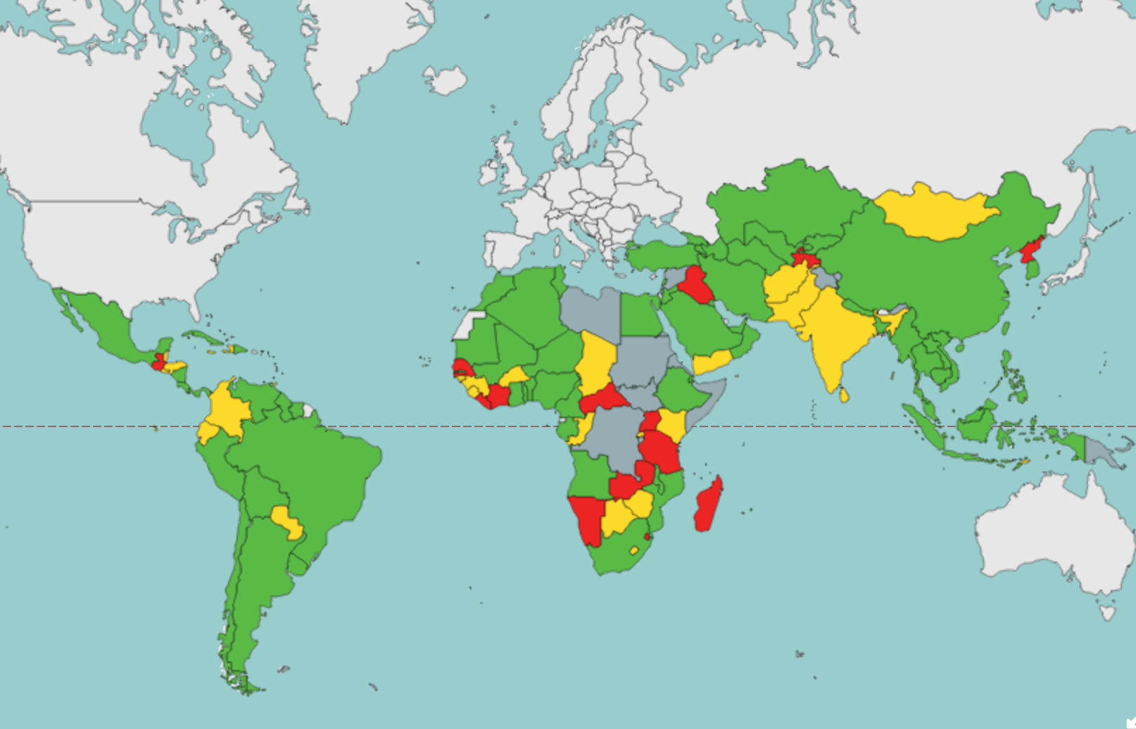
The FAO credits rising income levels, a reduction of inequality and huge progress on food insecurity in Latin America to have propelled global progress over the last 15 years. Still, as you can see from the map, progress is uneven across regions.
The big takeaway from this map is that the Millennium Development Goal of reducing by half the global prevalence of undernutrition is so…very…close to being achieved in the developing world. The drop of 23.3% to 12.9% means that the MDG is a mere 0.8% from being reached!