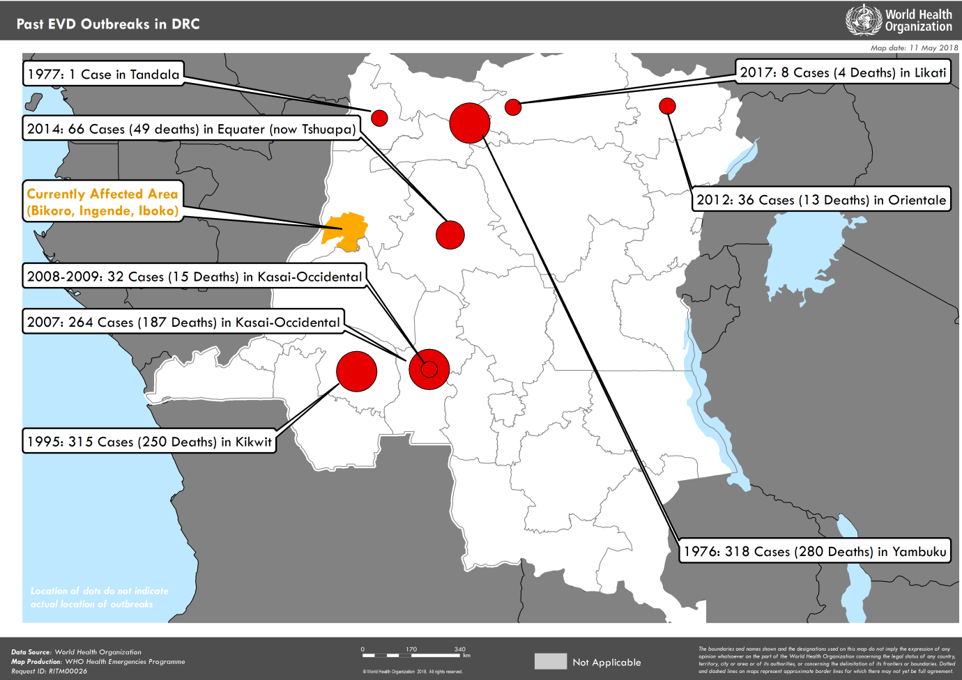
Today’s map comes from the World Health Organization, which released this graphic to help put into context the current ebola outbreak in the Democratic Republic of the Congo.

As you can see from this map, the DRC is no stranger to ebola outbreaks. This is in contrast to Liberia, Sierra Leone and Guinea which had never experienced an outbreak prior to 2014. That lack of experience is part of the reason that the 2014 outbreak spread so quickly. In contrast, the current DRC outbreak is so far being contained, in part, because the DRC health system does have a reservoir of expertise in dealing with outbreaks like this.
So far, the outbreak has killed 27 people, out of 58 cases of the virus. This is an exceptionally high death rate, but common for ebola–which is what makes this disease so potentially dangerous. The government of the DRC, the World Health Organization and its partners have mounted a massive response. This includes, for the first time, the use of a complex vaccination program to create “rings” around people believed to have come in contact with a person infected with the virus.
Meanwhile, international partners like the United States are contributing financially to this outbreak response. USAID has released some funds to help with this response. And the World Bank released money from its new outbreak emergency response fund. (But problematically, the White House is still seeking to cut $252 million in emergency funds “which can be used for building local capacities to spot and counter Ebola outbreaks like this one and others over Africa.”)
In its latest public update on the situation in DRC, the WHO today still declined to recommend any travel bans but did emphasize that “information about the extent of the outbreak is still limited and investigations are ongoing.”
So far, however, it would seem that a combination of DRCs experience with outbreaks and the WHO’s post 2014 response mechanism does seem to be mitigating this outbreak.
