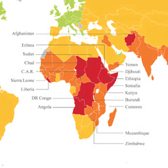
Ed note. This is the official global launch of what I hope be a daily series: “Map of the Day,” because who doesn’t like maps? –Mark
Risk analysis company Maplecroft has released a great new map on global food security. The map is based on the company’s Food Security Risk Index, calculated from 12 indicators of nutrition and health around the world.

What is immediately apparent from the map is a strong geographic relationship amongst the worst cases, with a large number of the countries residing in Central Africa and the Horn of Africa. However, as the map’s creators point out, there is a more important pattern: Of the ten countries with the worst food insecurity, all have long histories of armed conflict:
- Democratic Republic Of Congo
- Somalia
- Burundi
- Eritrea
- Angola
- Chad
- Ethiopia
- Haiti (tied with Ethiopia)
- Afghanistan
- Liberia (tied with Afghanistan)
The tragic takeaway is that the highest levels of persistent food insecurity is not caused by a lack of economic development or natural disasters, but rather by the disruption of food creation and distribution networks during human violence. The logistical connection from the fields to your plate remains one of humanities first — and greatest — inventions. Food changes hands a many times between when it is harvested (or slaughtered) and when it arrives on your plate. War disrupts this process in two ways. First, armed conflict pushes populations away from their food sources and distribution networks, leaving them vulnerable unless new networks can be established. Second, even if populations are not uprooted, fighting can hamper the food network’s functions, including delaying harvests and making transportation difficult or impossible. What the map makes clear is that when it comes to food security, peace appears to be just as important as farming.
Photo credit: Maplecroft
