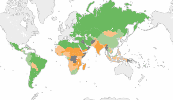
Today’s map comes via the International Food Policy Research Institute, which compiles an annual listing to measure levels of hunger around the world. Here’s how it is measured.
The 2013 Global Hunger Index (GHI) is calculated for 120 countries for which data on its three component indicators are available and where measuring hunger is considered most relevant.
The GHI combines three equally weighted indicators into one score: the proportion of people who are undernourished, the proportion of children under five who are underweight, and the mortality rate of children younger than age five.
An increase in a country’s GHI score indicates that the hunger situation is worsening, while a decrease in the score indicates improvement in the country’s hunger situation.

In all, there are 19 countries where the hunger situation is “alarming” or “extremely alarming.” 842 million people were chronically under nourished according to the most recent data. I encourage you to spend some time with the interactive map and watch the video interview with the lead researcher of this project who offers some context and analysis of these figures.
